.png)
Herbalife E-commerce
.avif)
Project Overview
Herbalife sought a transformation that was innovative, cohesive, and consisted of consumer-first messaging. As a UI Designer on the team, I contributed to a majority of the UI design of the website and researched our consumers extensively to align with them and the client. I was also a part of the library team where I helped maintain this new design system and solved problems for any component-related work.
Challenge
Herbalife has been in the health + wellness industry for over 40 years, but their brand image was yet to be updated. The company was hindered by their antiquated digital presence.
Solution
Our studio produced a revamped brand identity and e-commerce website that provided a seamless shopping experience, which significantly boosted user engagement. We handed off an integrated B2B2C model and a robust 600+ component design library to the client.
The Process
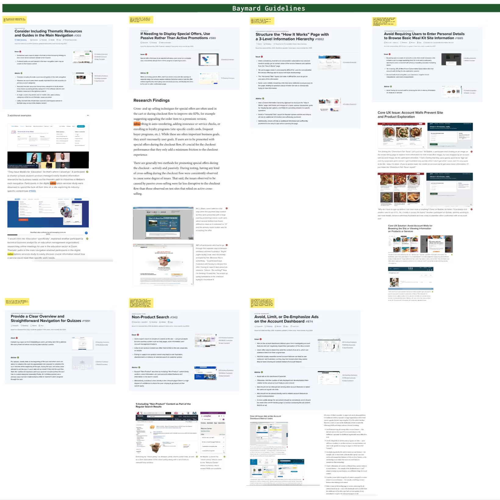
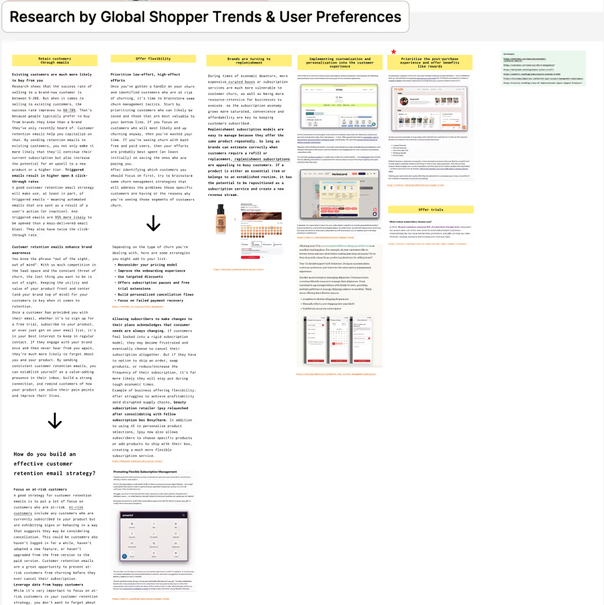
Initially, we conducted extensive UX research to pinpoint users', pain points and identify opportunities to improve for the MVP. Our UX research consisted of audits, persona development, journey mapping, best practices, and trends. This helped us immensely when moving on to the next phase - wireframing.
The E-Commerce Experience

Home Screen
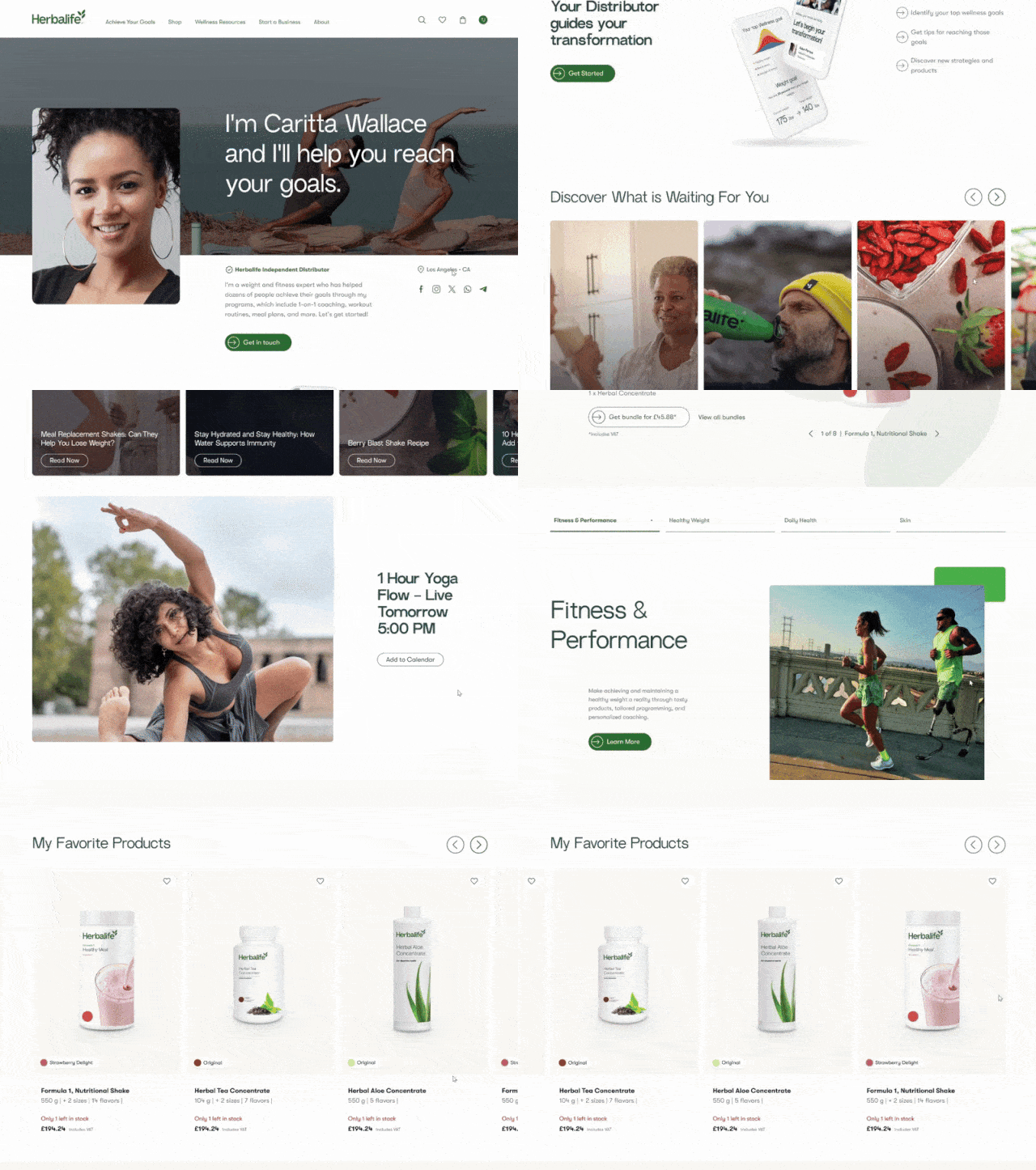
With our rebrand, we completely transformed the home page to a modern and clean design with pops of color. We designed it with the Herbalife community in mind by adding language that focuses on their health, imagery of Herbalife consumers, a testimonial section, and a carousel of articles for the user to read through.

PLP to Order Confirmation Flow
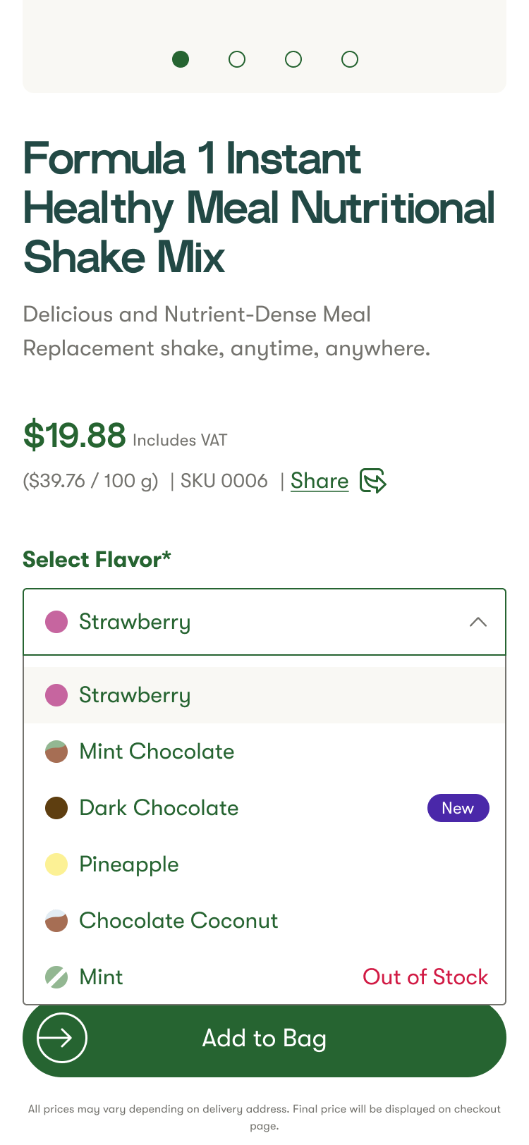
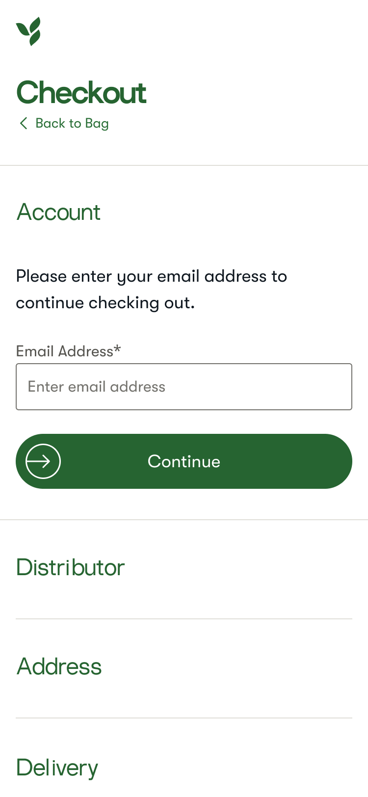
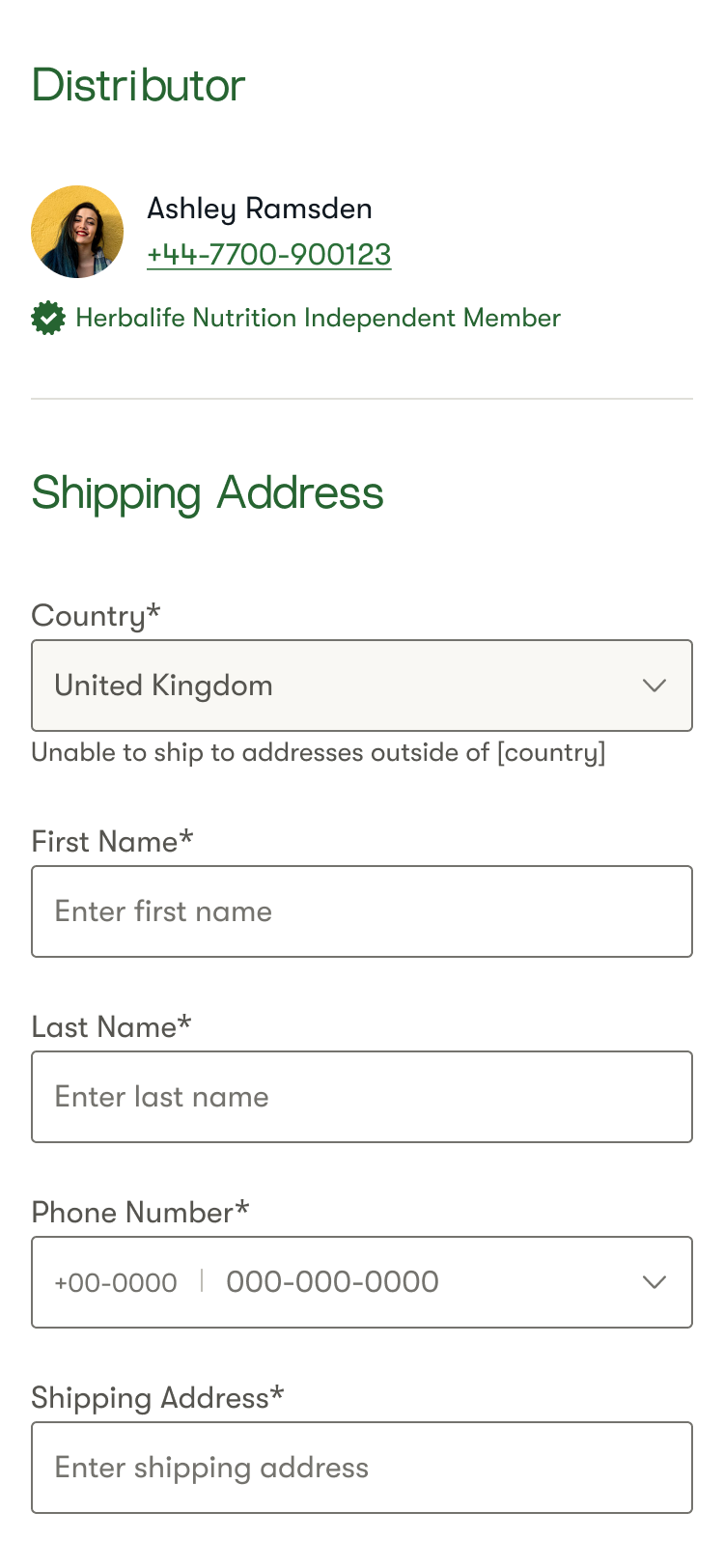
We ensured that buying an item would be simple. The customer will go through the product listing page (PLP), choose a product, and go to its product display page (PDP). The customer can easily select shades via the dropdown and add them to their bag via the Add to Bag CTA, which converts into a sticky footer once the user scrolls past it. The Added to Bag flyout appears and user can choose to check out, view bag, or shop from the "People also bought" section. Once they're in their shopping bag, they can start the order process and make their purchase.
Distributor Home Screen
Another way for a customer to make a purchase is by connecting with a distributor (DS) - someone who sells HL products. The DS Homepage is a distributor's store, where their customers can purchase through them and view their content. A distributor can create their own site via the MyHerbalife platform - a backend platform that helps them build their e-commerce stores to life.
Connect to DS Prototype
The customer will connect to a distributor via the PDP. From there, the customer will be taken to a flyout with three options to start their search. In this case, the customer is unauthorized and will enter the DS's name, business, website, and/or postal code, which is the second option. Once they click search, they will view the listed distributors. They can also click on "You searched for _" to edit their search fields. If the customer has exhausted all their options, they can scroll further down to an automatically assigned distributor. Once customer connects, they will be directed to the contact form which is required to fill out. After the customer completes the form and submits, they will be directed to a confirmation screen which is a thank you message. Feel free to try the prototype below!
Account Management
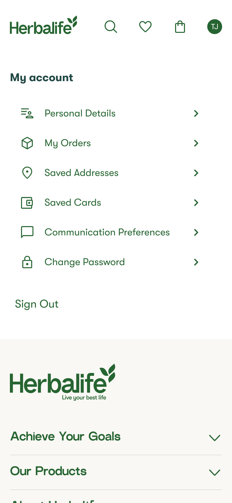
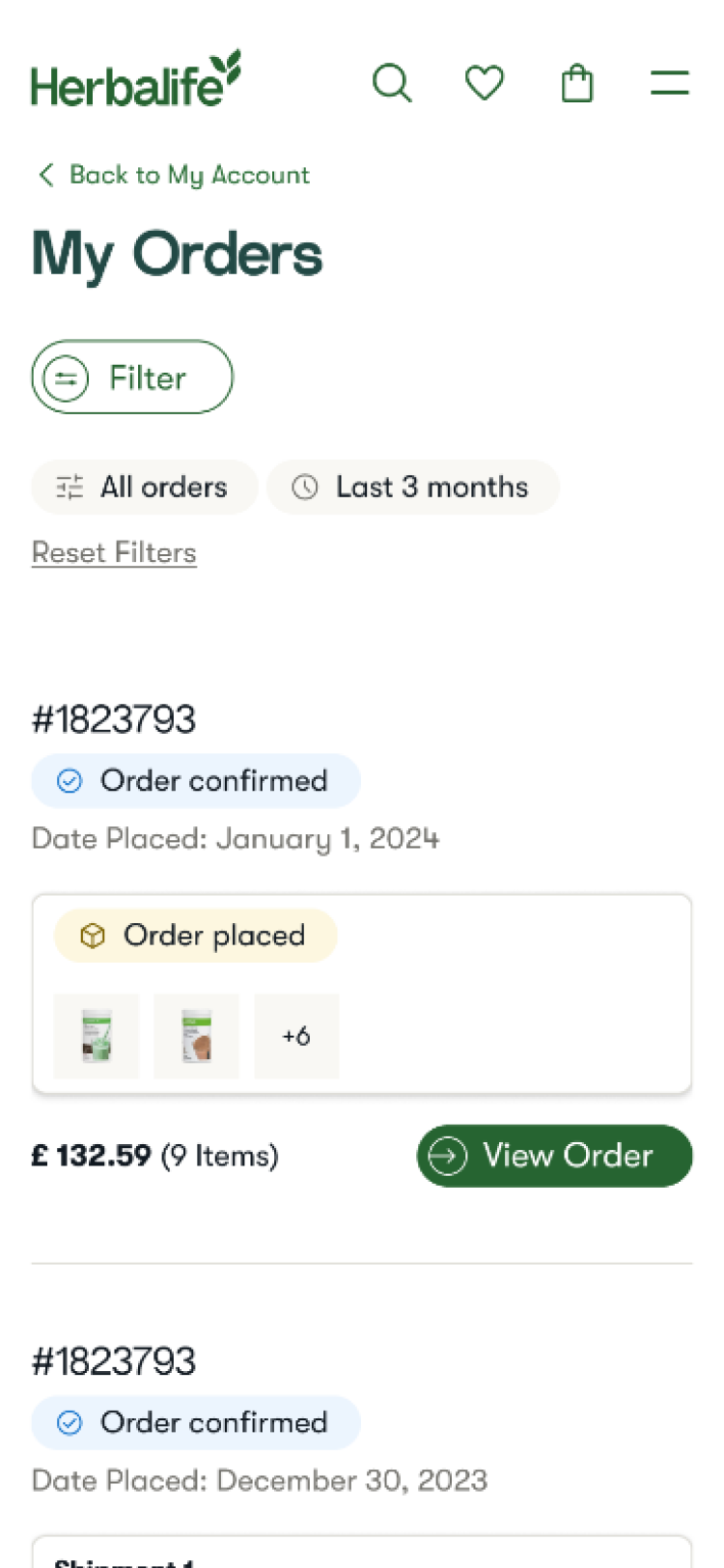
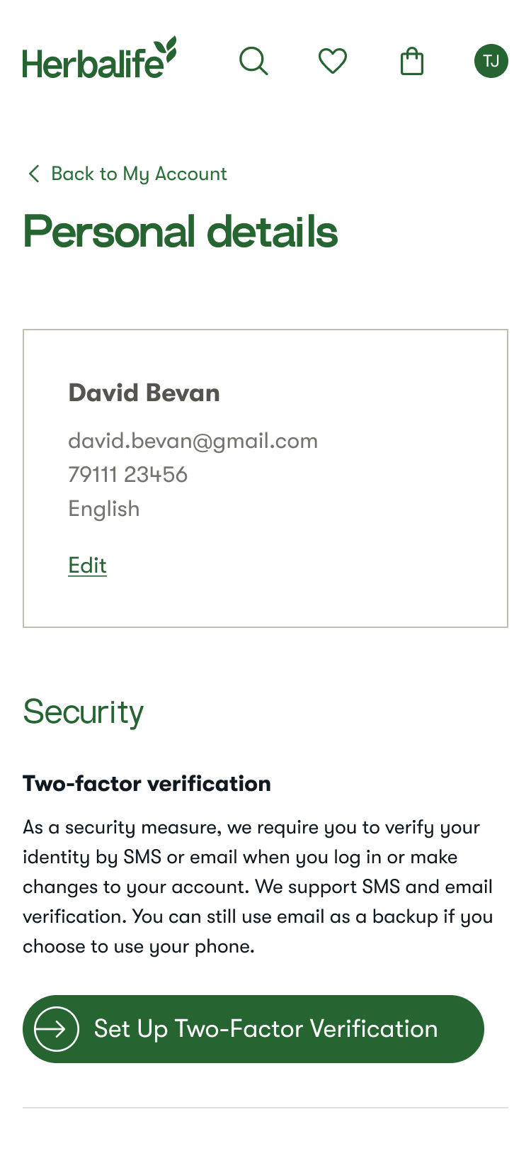
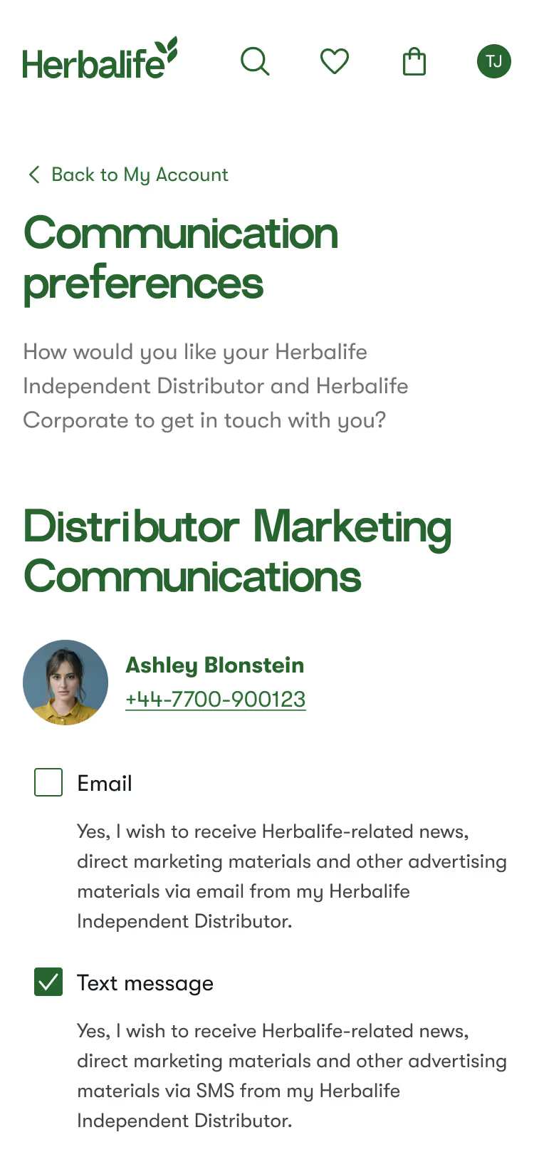
We designed account management to be simple and user-friendly. When an authorized user clicks on the initials icon on the top right corner of the navigation bar, they are taken to their account page. The initial page will feature navigation that allows users to click on any desired page. Users can access and edit all aspects of their account, including personal details, security settings, saved addresses, saved cards, communication preferences with DS and Corporate, and their password.
Design System
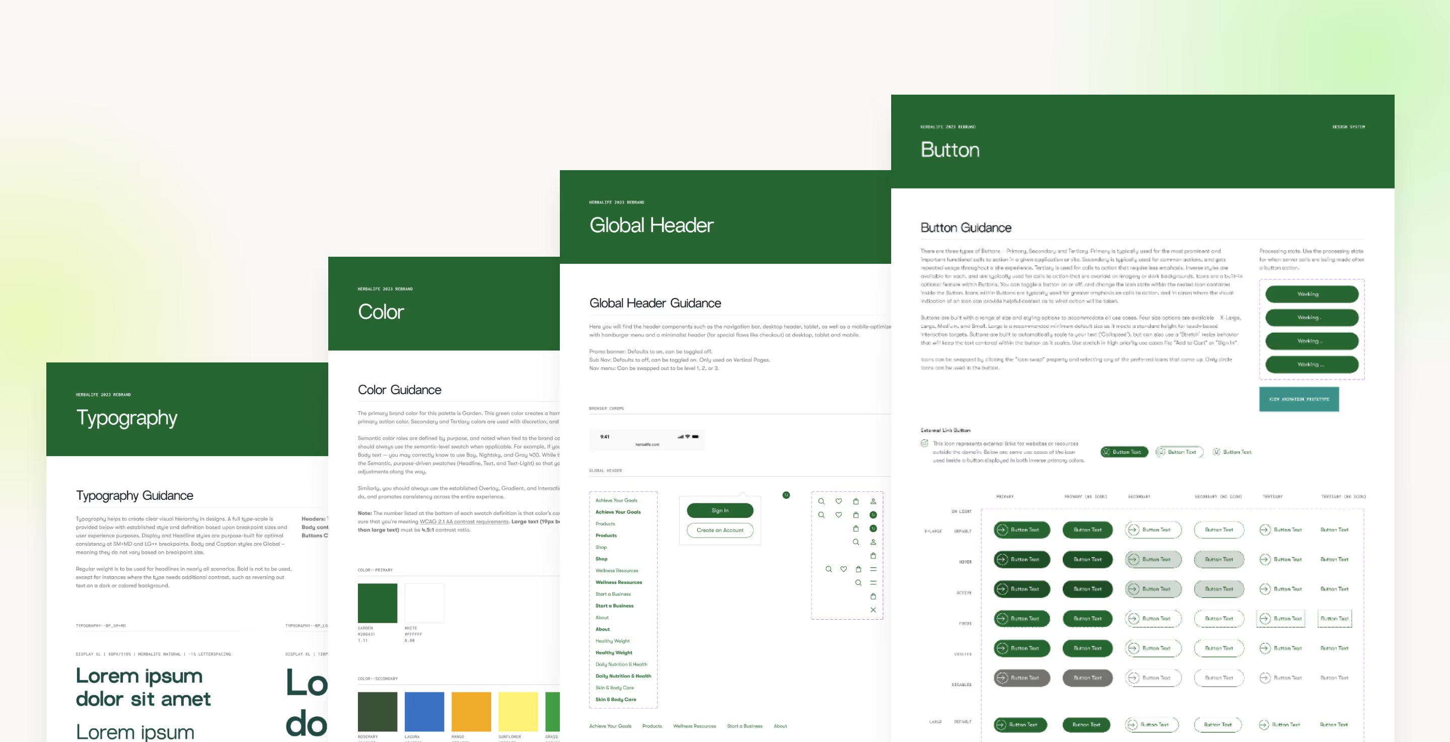
Our design team established a new design system in Figma, where we enhanced their existing visual identity and pushed it further to refresh it. This included a comprehensive set of new typography, colors, CTAs, forms, grids, badges, and modals. We focused on creating clean and cohesive visuals while adhering to the brand guidelines.
Takeaways
We had a strong cross-functional team consisting of creative directors, designers, copywriters, business analysts, and a product manager who worked closely together to ensure smooth integration of all elements.
I was involved in the project from the initial stages of ideation right through to the maintenance of the visuals, including designing past the MVP stage. This experience taught me a great deal, and I even developed a new specialty in library maintenance, which I found to be a valuable experience.
As a result, analytics show that our design efforts demonstrate a significantly improved user experience. Below are some key performance indicators that highlight the impact of our work since the launch.
.avif)
.avif)
.png)
.png)
.avif)



.png)

