Reformation UI Redesign
Project Overview
A UI redesign of the Reformation website on both mobile and desktop.
Challenge
The current website feels very plain and empty and lacks a design system. Its dull web design doesn’t align with the brand’s personality and clothing.
Solution
A more colorful and playful look that uses illustrations, gradients, blobs, and thin lines, along with a new primary brand color, to achieve a visually engaging look.

The Flow
Task: Search a product and add to cart.

The Mobile Prototype
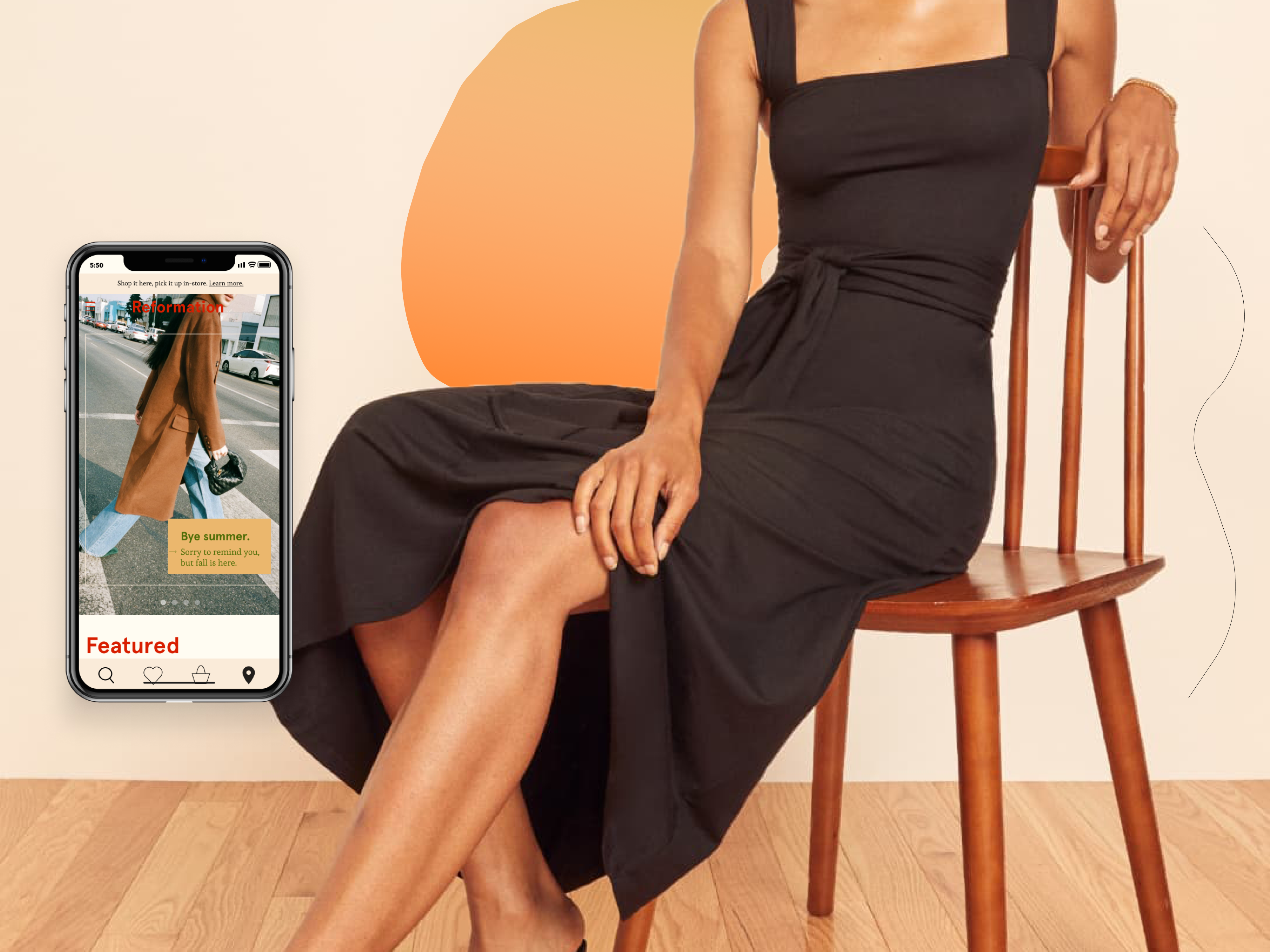
Home Screen
A slideshow component card is used for the promotional content on the home screen to keep the user visually engaged. Illustrations, blobs, and thin curvy lines make the experience more fun and playful.
The navigation bar is the main UI feature users will use to navigate their way through the website.
.gif)
Search
.gif)
After searching, the user gets to click show results and it’ll take them to their Results page. The Results page has an in-store pickup button, filter button, and sort button for the user to work with.
Filters, PDP & Item to Cart
.gif)
When they click on a product, they are taken to the Product Display Page. Once the user adds the product to bag, they are taken to the Item Saved page. This page includes a friendly message for adding something to bag, the product image and details, and two buttons: checkout and view bag.
Figma Link
The Desktop Prototype
Home Screen
All sections and flows are the same between mobile and desktop, with a few exceptions, such as the the featured categories having actual images for them. Desktop is meant to show responsive design and usability.
The menu options are at the top bar navigation.
.gif)
Search
.gif)
Filters, PDP, & Item to Cart
.gif)
Figma Link
The Design System
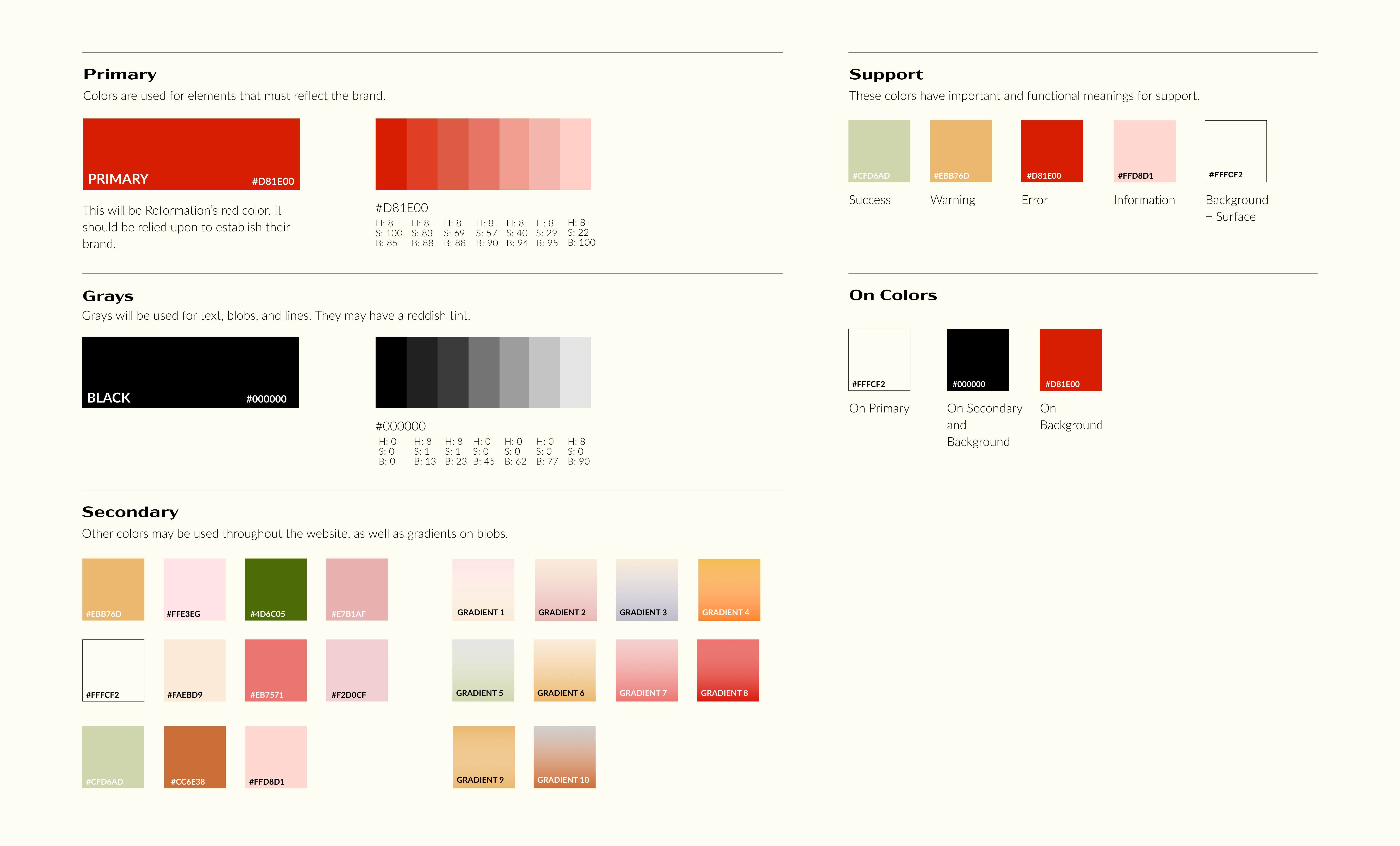
Colors
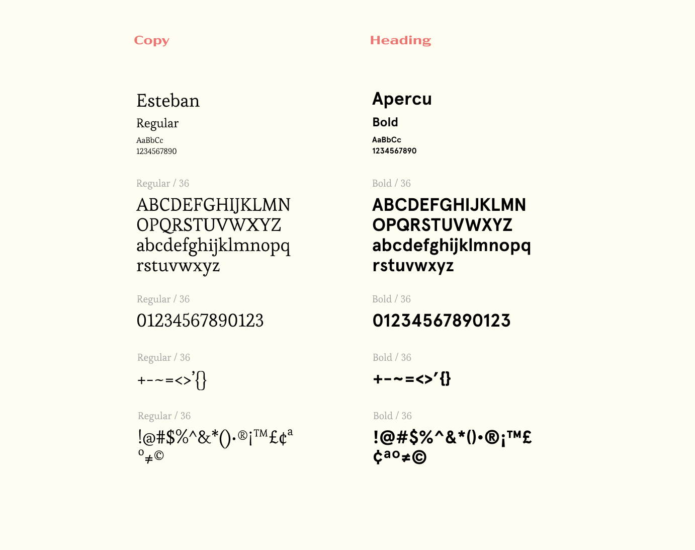
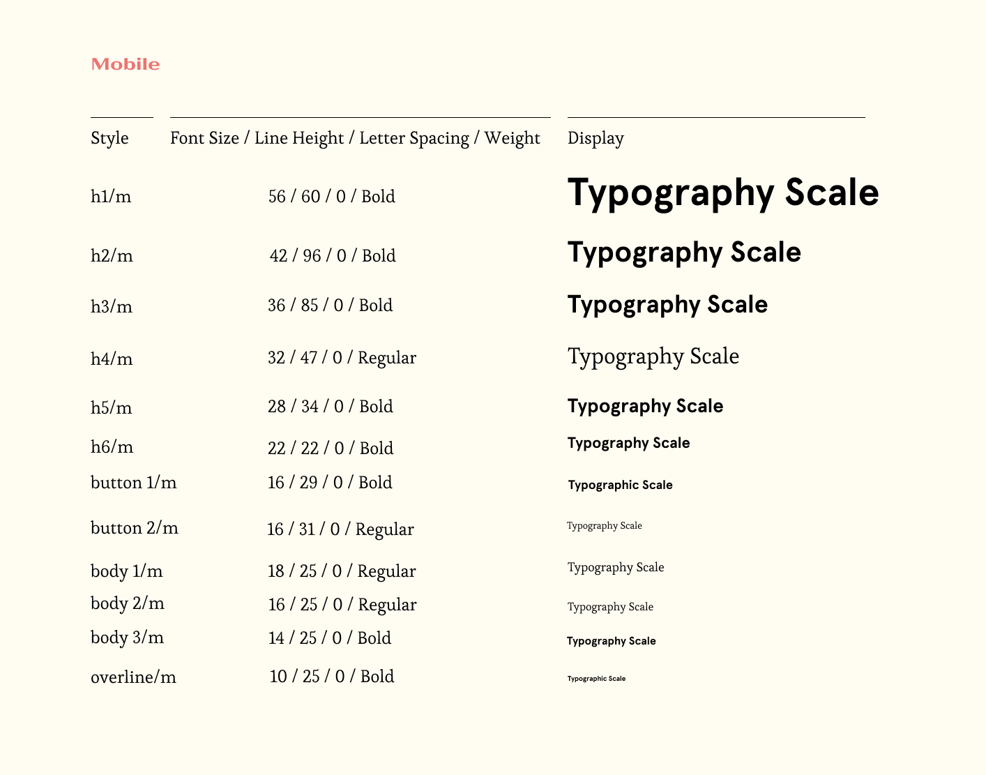
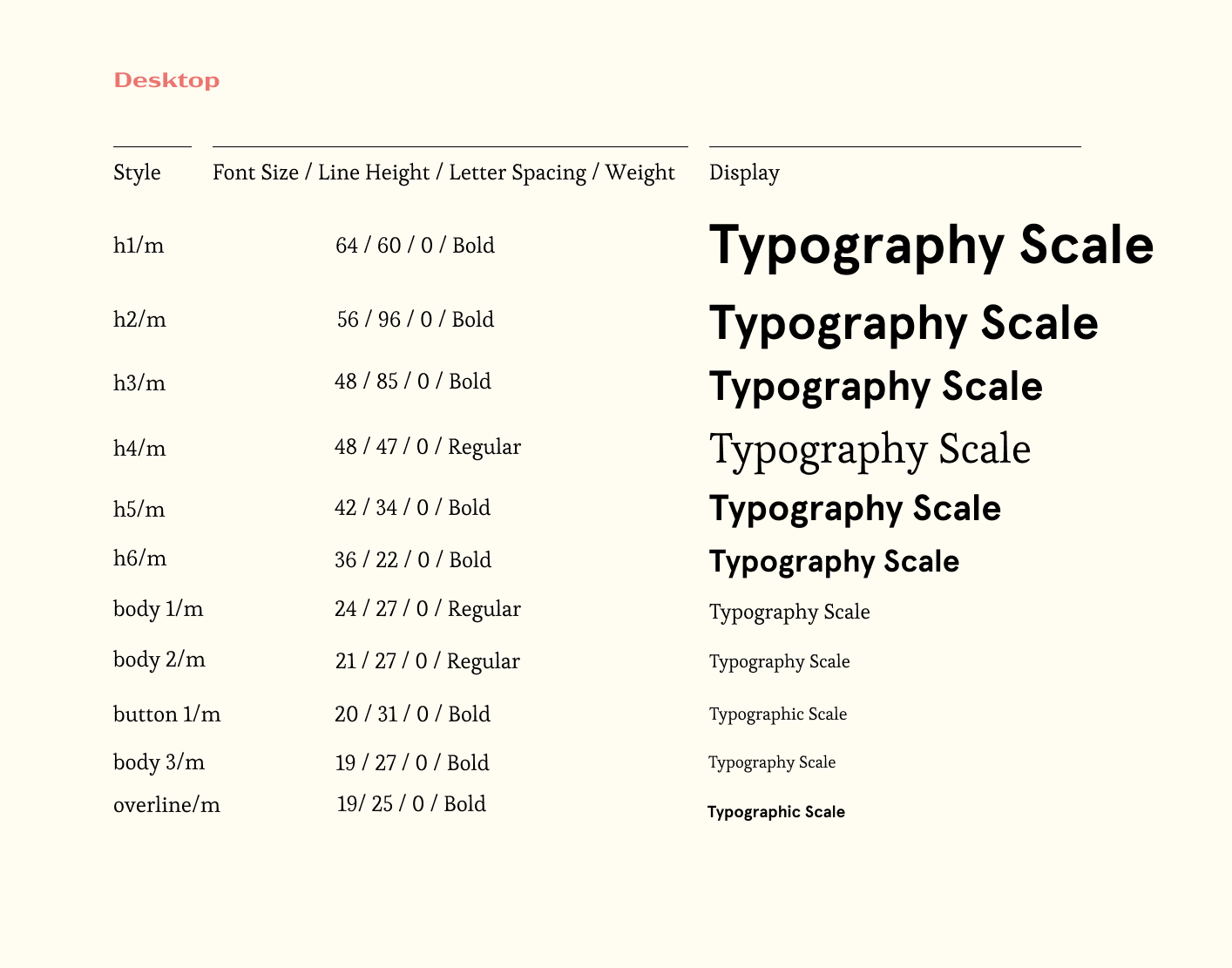
Typography
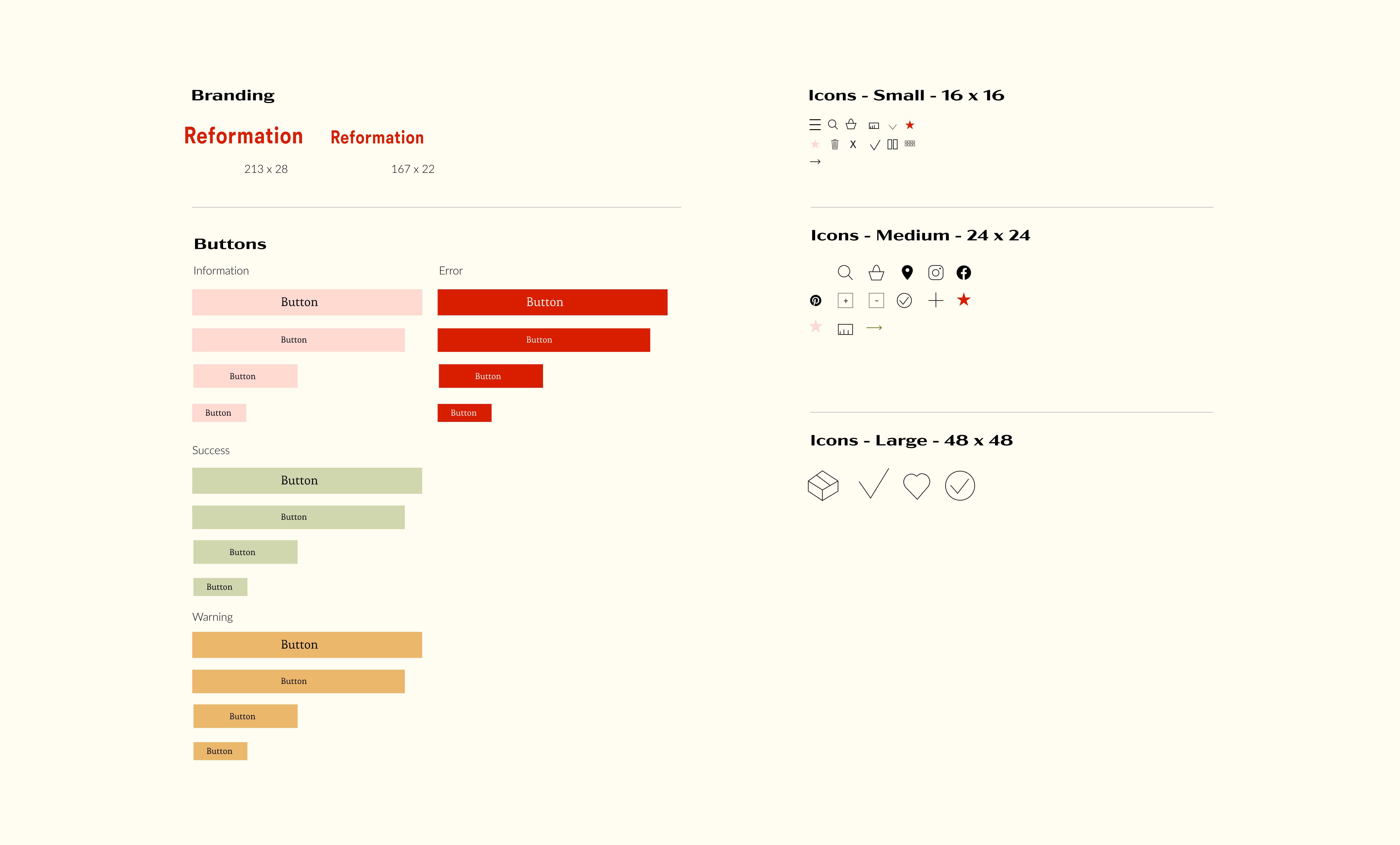
Buttons & Icons
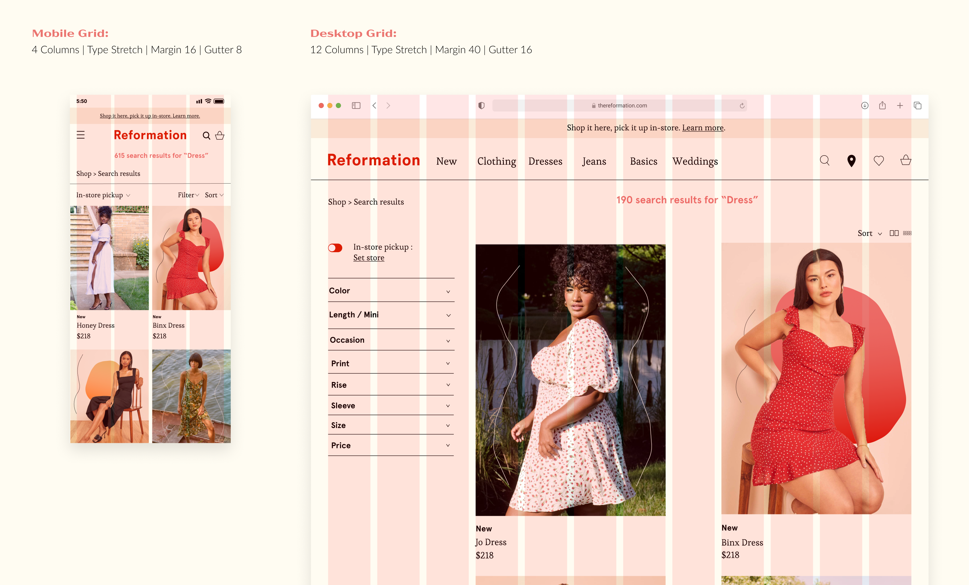
Grids
Takeaways
In order to have a successful UI redesign, you must be mindful of the different types of users that will use the product and make sure your design fits a wide range of people and their capabilities.
Credit
Design by: Sophie Tatarchuk
Course: CT302
Professor: Christie Shin
Disclaimer - Please note: This classroom project was created for the course “CT302 Digital Product Design I.” This is purely for educational purposes and I do not claim any textual information and/or photos.
.svg)